 |
| Norwegian Donald Pocket #491, regular size (left). large size edition (right) |
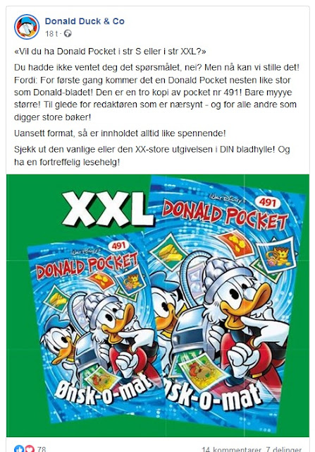
Yesterday we got a little surprise in the comic racks in Norwegian stores. The new issue of the long running Donald Pocket series suddenly was on sale in two different sizes! This came out of the blue with no previous announcement, but we got a short (not very informative) message on the publisher's Facebook page the same day.
 |
| Facebook post about the large edition |
As I write this, we don't have any more information to go on, and it is unclear if this was just a one-time experiment or if they plan on changing the size or continue publishing two editions.
Apart from the size and some minor cover details the two editions are identical. They even have the same price.
 |
| Back cover |
But the spine is different where the regular sized pocket has part of an image continuing from previous books. The new larger one just has a blue spine with a title*, but have the same numbering.
[* The cover title is "Ønsk-o-mat", spine title is "Ønsko-o-mat", the story title the cover is referring to is "Ønsk-o-maten", while the table of contens title for the same story is "Drømmeprinteren"...]
I tried to compare the paper used, and it does look like they have different paper. But it's not a very noticeable difference.
I guess the big question is, what version is the preferred one? The pocket format has a long tradition in Europe, originating with the Italian I Classici di Walt Disney, and have been published since the late 60's. And it would not be the same having the format gone or changed. But personally, there's no doubt that I prefer the larger one! I've never liked the pocket format much and prefer to read my comics in a larger size.
 |
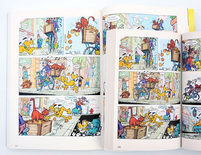
| Example from inside the books |
Edit after reading comments:
The lettering/text font is not scaled the same way as the art in the large version. The result is slightly different formatting inside the speech balloons.
 |
| From the regular sized pocket book (left) and the larger one (right) |
 |
| From the regular sized pocket book (left) and the larger one (right) |
This went wrong on one page in the large version with the text ending up like this:
 |
| From the regular sized pocket book (top) and the larger one (bottom) |
The text is misaligned and smaller than the rest of the story on the entire page the panel above is taken from. But it's the only page in the book with this error.

I can see that there are differences in the lettering between the two versions. Look at the kid on the top of the page on the right in that last photo.
ReplyDeleteNice catch! I did not notice this, but the lettering is slightly different formatted through the entire book. I updated the post with a few examples.
DeleteThe text looks better in the small-size pocket book. Though, it's kind of interesting from a technical viewpoint. You'd think the simplest method when doing the larger book would be to just blow up the text in the small-size book... but apparently this is not the case. They had to redo the lettering for the larger edition.
ReplyDeleteAlthough not the same idea of an edition reproduced in different sizes, in Brazil we had both Donald Duck's 50th and 60th anniversaries kits where there were three issues of different sizes on the kits. And as an added bit of trivia, I don't know if there is another country where the official Donald Duck Magazine had four different sizes throughout its history: 20x26cm(1-21),13.5x21cm(22-1468),13.5x19cm(1470-1750), 15x22cm(1751-1764) and 13.5x19cm again (from 1765 to 2481).
ReplyDelete